This project was done in collaboration with another designer for a focused, three-week branding initiative to transform Cinnabon’s visual identity—modernizing its look while preserving its signature warmth and nostalgic charm.
Timeline
3 weeks
Tools
Illustrator, After Effects, Premiere Pro, Figma
Team
Paired with another product designer
01 / Why?
Modernize without losing warmth
Our objective was to create a comprehensive branding package that would modernize Cinnabon's image while preserving its nostalgic charm.
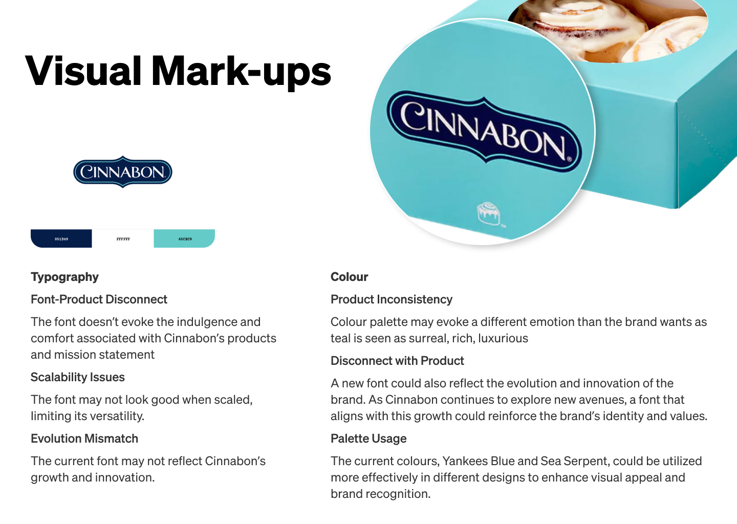
02 / Research and Discovery
Anchoring the rebrand in brand truth
We began by analyzing Cinnabon's existing brand elements, identifying key attributes such as Quality, Whimsical, and Irresistible. This analysis informed our design direction, ensuring alignment with Cinnabon's mission to "spread warmth" and its core values of community and family.
03 / Approach
Meaningful change, not cosmetic change
When redesigning it's important to design change based upon meaning—not choices that take away from the identity of what or who it was. The goal is to keep the brand that everyone loves while bringing it into a new era.
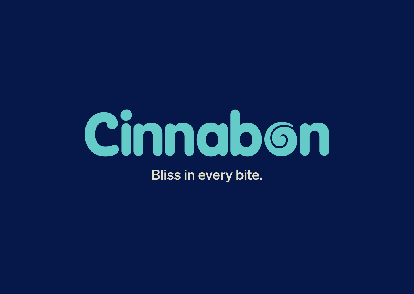
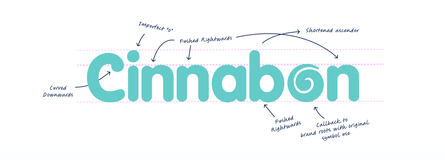
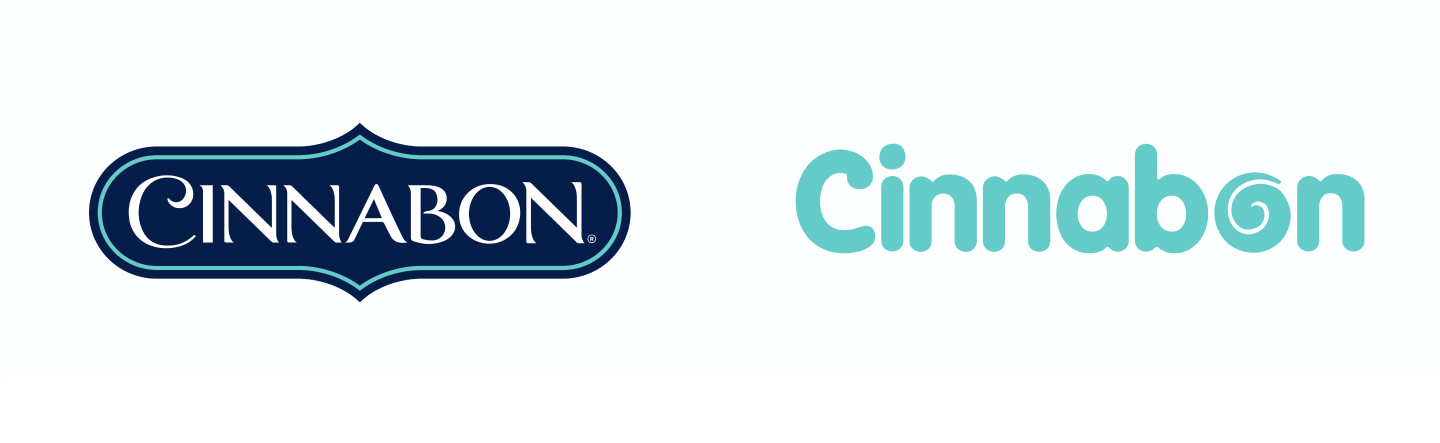
1. Logo Update
Introducing a squishy, indulgent wordmark to convey friendliness and sweetness, reflecting the irresistible nature of Cinnabon's products.
2. Icon Incorporation
Reintroducing the cinnamon swirl icon from the 1985 logo to honor the brand's heritage and emphasize its history.
3. Playful Interaction
Designing an imperfect logo to mirror the handcrafted quality of Cinnabon's cinnamon rolls and maintain a playful tone.
04 / Brand Liftoff
Brand in motion
Parts of the brand package included a new video commercial I created to bring the new identity to life. This project taught me how to blend storytelling with visual elements, ensuring the brand's warmth and indulgence were conveyed effectively.
Brand in Motion
The commercial gave me the opportunity to see how brand elements—such as the new logo, color scheme, and typography—come to life in motion. I learned how these elements need to work seamlessly together to maintain a consistent and dynamic brand presence across different media formats.
Impact on Brand Image
Through the video, I realized how moving visuals can significantly elevate a brand's image and convey its personality in a more dynamic, engaging way than static images alone.
Balancing Modern Design with Heritage
I learned how to incorporate a modern touch into a beloved, traditional brand while respecting its legacy. This process taught me the importance of preserving a brand's core identity while evolving to meet contemporary consumer expectations.
05 / Wrap it Up
From type to packaging
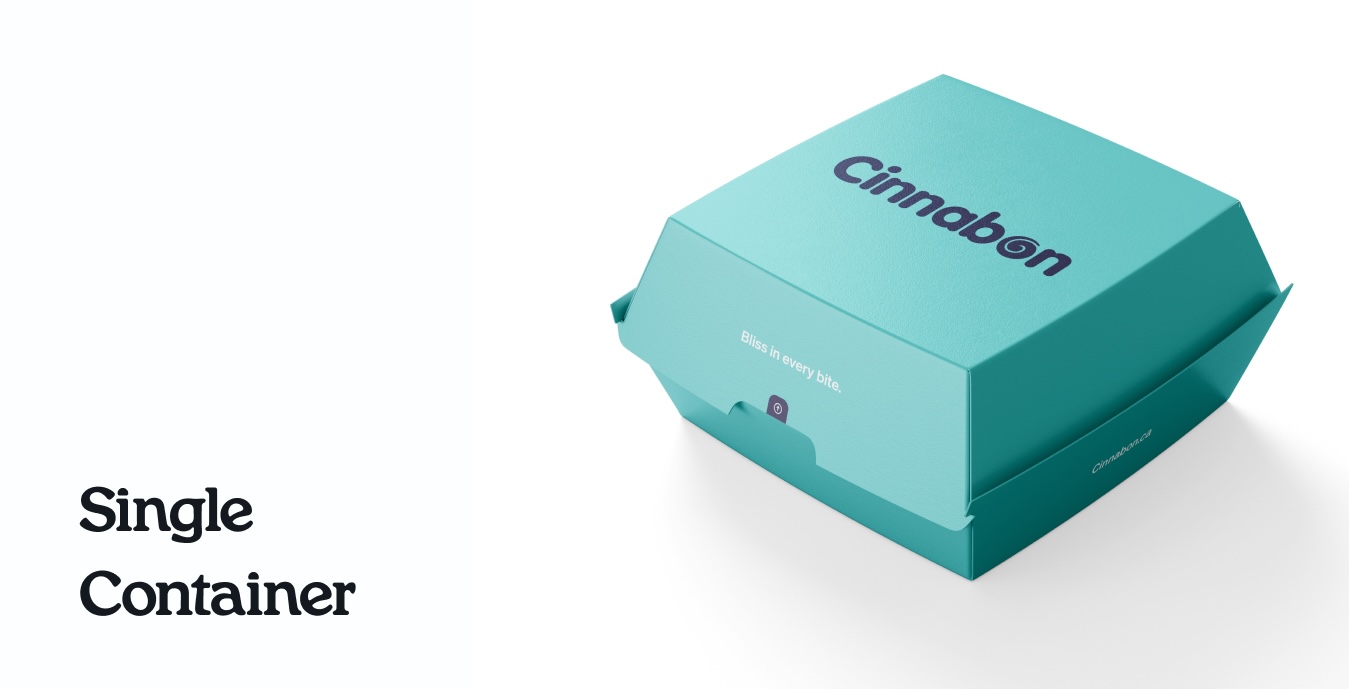
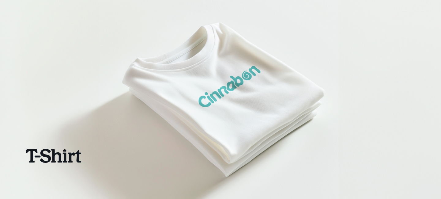
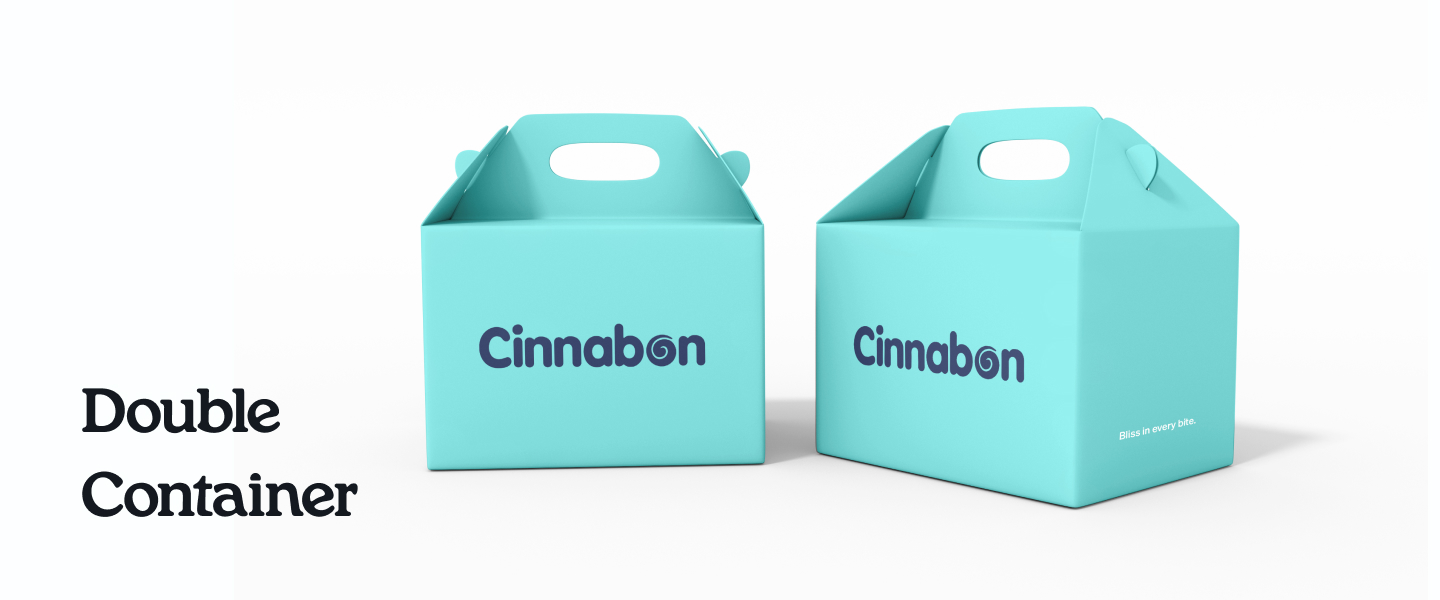
The redesigned branding package was developed over three weeks—everything from typefaces to packaging. These were created in Illustrator.
Enhance Brand Recognition Modernizing the visual identity to attract a wider audience while retaining loyal customers.
Strengthen Market Position Reinforcing Cinnabon's core values and nostalgic appeal to differentiate it from competitors.
Drive Sales Growth Creating a compelling brand presence that resonates with consumers and encourages increased patronage.