
GBDA Society
Product
Design
Marketing
Film
Deliverables
The ultimate student society.
Why?
Our objective was to create a comprehensive branding package that would modernize Cinnabon's image while preserving its nostalgic charm.

Research and Discovery
We began by analyzing Cinnabon's existing brand elements, identifying key attributes such as
Quality
Whimsical
Irresistable
This analysis informed our design direction, ensuring alignment with Cinnabon's mission to "spread warmth" and its core values of community and family.
Quality
Whimsical
Irresistable
This analysis informed our design direction, ensuring alignment with Cinnabon's mission to "spread warmth" and its core values of community and family.

Approach
When redesigning it's important to design change based upon meaning. Not the choices that can take away from the identity of what or who it was. The goal is to keep the brand that everyone loves but now bringing it into a new era.
1. Logo Update
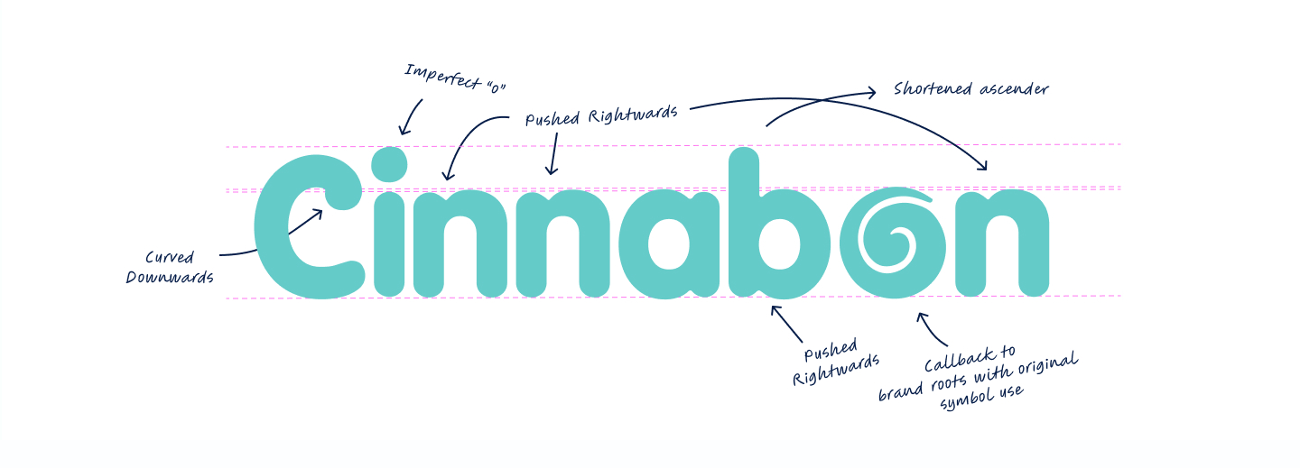
Introducing a squishy, indulgent wordmark to convey friendliness and sweetness, reflecting the irresistible nature of Cinnabon's products.
Introducing a squishy, indulgent wordmark to convey friendliness and sweetness, reflecting the irresistible nature of Cinnabon's products.
2. Icon Incorporation
Reintroducing the cinnamon swirl icon from the 1985 logo to honor the brand's heritage and emphasize its history.
Reintroducing the cinnamon swirl icon from the 1985 logo to honor the brand's heritage and emphasize its history.
3. Playful Interaction
Designing an imperfect logo to mirror the handcrafted quality of Cinnabon's cinnamon rolls and maintain a playful tone.
Designing an imperfect logo to mirror the handcrafted quality of Cinnabon's cinnamon rolls and maintain a playful tone.


Brand Liftoff
Parts of the brand package included a new video commercial I created to bring the new identity to life. This project taught me how to blend storytelling with visual elements, ensuring the brand’s warmth and indulgence were conveyed effectively.
Brand in Motion
The commercial gave me the opportunity to see how brand elements—such as the new logo, color scheme, and typography—come to life in motion. I learned how these elements need to work seamlessly together to maintain a consistent and dynamic brand presence across different media formats.
The commercial gave me the opportunity to see how brand elements—such as the new logo, color scheme, and typography—come to life in motion. I learned how these elements need to work seamlessly together to maintain a consistent and dynamic brand presence across different media formats.
Impact on Brand Image
Through the video, I realized how moving visuals can significantly elevate a brand’s image and convey its personality in a more dynamic, engaging way than static images alone.
Through the video, I realized how moving visuals can significantly elevate a brand’s image and convey its personality in a more dynamic, engaging way than static images alone.
Balancing Modern Design with Heritage
I learned how to incorporate a modern touch into a beloved, traditional brand while respecting its legacy. This process taught me the importance of preserving a brand's core identity while evolving to meet contemporary consumer expectations.
I learned how to incorporate a modern touch into a beloved, traditional brand while respecting its legacy. This process taught me the importance of preserving a brand's core identity while evolving to meet contemporary consumer expectations.
Wrap it Up!
The redesigned branding package was developed over three weeks, everything from type faces to packaging. These were created in Illustrator.

Enhance Brand Recognition
Modernizing the visual identity to attract a wider audience while retaining loyal customers.
Modernizing the visual identity to attract a wider audience while retaining loyal customers.

Strengthen Market Position
Reinforcing Cinnabon's core values and nostalgic appeal to differentiate it from competitors.
Reinforcing Cinnabon's core values and nostalgic appeal to differentiate it from competitors.

Drive Sales Growth
Creating a compelling brand presence that resonates with consumers and encourages increased patronage.
Creating a compelling brand presence that resonates with consumers and encourages increased patronage.
What is MUR?
The MUR team at the University of Waterloo is a specialized group responsible for promoting the university's undergraduate programs to prospective students worldwide. The team develops and executes marketing strategies designed to showcase the university's unique strengths, academic offerings, and campus culture. By leveraging digital platforms, storytelling, and data-driven insights, the MUR team aims to attract a diverse and talented pool of students.
Transforming Recruitment Through Social Creativity
Content Strategy & Execution
I developed and implemented data-driven content strategies targeting a diverse audience of over 100,000 📈 prospective students globally. My initiatives resulted in a 18% increase in social media engagement within one month.
I developed and implemented data-driven content strategies targeting a diverse audience of over 100,000 📈 prospective students globally. My initiatives resulted in a 18% increase in social media engagement within one month.
Video Production & Editing
As the film production editor 🖥️ for the university's official podcast, I enhanced its storytelling through engaging video and audio content, expanding its reach to a global audience.
As the film production editor 🖥️ for the university's official podcast, I enhanced its storytelling through engaging video and audio content, expanding its reach to a global audience.
Trend Analysis & Innovation
Staying ahead of industry trends was key 🔑 to my success. I crafted tailored campaigns that resonated with international markets, ensuring our messaging was both impactful and culturally relevant.
Staying ahead of industry trends was key 🔑 to my success. I crafted tailored campaigns that resonated with international markets, ensuring our messaging was both impactful and culturally relevant.
Platform Management
I managed content across platforms such as YouTube, Instagram, and Spotify, optimizing reach and engagement 👀 for prospective students.
I managed content across platforms such as YouTube, Instagram, and Spotify, optimizing reach and engagement 👀 for prospective students.

Designing Impact
Large Booth Presence
Given the large size of UofWaterloo’s booth at the Ontario University Fair, I designed digital signage and motion graphics to strategically fill the space and create a visually cohesive experience.
Given the large size of UofWaterloo’s booth at the Ontario University Fair, I designed digital signage and motion graphics to strategically fill the space and create a visually cohesive experience.
Dynamic Student Experience
I designed graphics that showcased the university’s dynamic, interdisciplinary student experience, highlighting how Waterloo blends multiple fields of study.
I designed graphics that showcased the university’s dynamic, interdisciplinary student experience, highlighting how Waterloo blends multiple fields of study.
Engaging Visuals
The motion graphics I developed were integral in capturing the visitors’ attention. The vibrant and interactive designs not only highlighted Waterloo's strengths but also encouraged deeper engagement 😀 with the booth, making the experience memorable for attendees.
The motion graphics I developed were integral in capturing the visitors’ attention. The vibrant and interactive designs not only highlighted Waterloo's strengths but also encouraged deeper engagement 😀 with the booth, making the experience memorable for attendees.
Forward-Thinking Education
By creating visuals that emphasized Waterloo’s innovative approach to education, my designs reinforced the message that the university is a leader in offering cutting-edge, future-focused programs ⭐.
By creating visuals that emphasized Waterloo’s innovative approach to education, my designs reinforced the message that the university is a leader in offering cutting-edge, future-focused programs ⭐.


Numbers that matter.
Trend Research & Audience Insights
Conducted extensive research to understand current trends in international student recruitment, ensuring the campaign resonated with a global audience on Instagram.
Conducted extensive research to understand current trends in international student recruitment, ensuring the campaign resonated with a global audience on Instagram.
Creative Composition & Visual Design
Crafted a dynamic, attention-grabbing composition using engaging visuals that highlighted the top 5 reasons to study in Canada, effectively conveying key messages in a concise and appealing format.
Crafted a dynamic, attention-grabbing composition using engaging visuals that highlighted the top 5 reasons to study in Canada, effectively conveying key messages in a concise and appealing format.
Strategic Editing for Social Media Impact
Edited the short reel with a fast-paced, engaging flow, optimized for Instagram’s platform, ensuring it captured attention quickly and maintained viewer engagement throughout.
Edited the short reel with a fast-paced, engaging flow, optimized for Instagram’s platform, ensuring it captured attention quickly and maintained viewer engagement throughout.
Performance Optimization & Engagement Growth
Leveraged insights from audience interaction to optimize the campaign, contributing to an impressive 5 million views and significant engagement across international markets.
Leveraged insights from audience interaction to optimize the campaign, contributing to an impressive 5 million views and significant engagement across international markets.
“He is pleasure to work with, bringing his enthusiasm, creativity and attention to detail to every project he worked on. His technical skills in design and video production are excellent, and he’s a great problem solver with many innovative ideas.”
What is GBDA Society?
The Global Business and Digital Arts (GBDA) Society is the official student association representing the University of Waterloo’s GBDA program. The society fosters community, professional development, and creative growth by hosting case competitions, co-op panels, networking events, and student showcases. It serves as a hub for collaboration, connecting students with peers, alumni, and industry professionals while amplifying the program’s identity on a global stage.
Director of Content Development
Starting initially as a Social Media Lead, I was later promoted within my term to lead content strategy and creative direction, oversee the full content lifecycle, and shape the society’s brand identity across digital and print. My work helps grow our community and engage members with impactful content.
Mini Case Studies
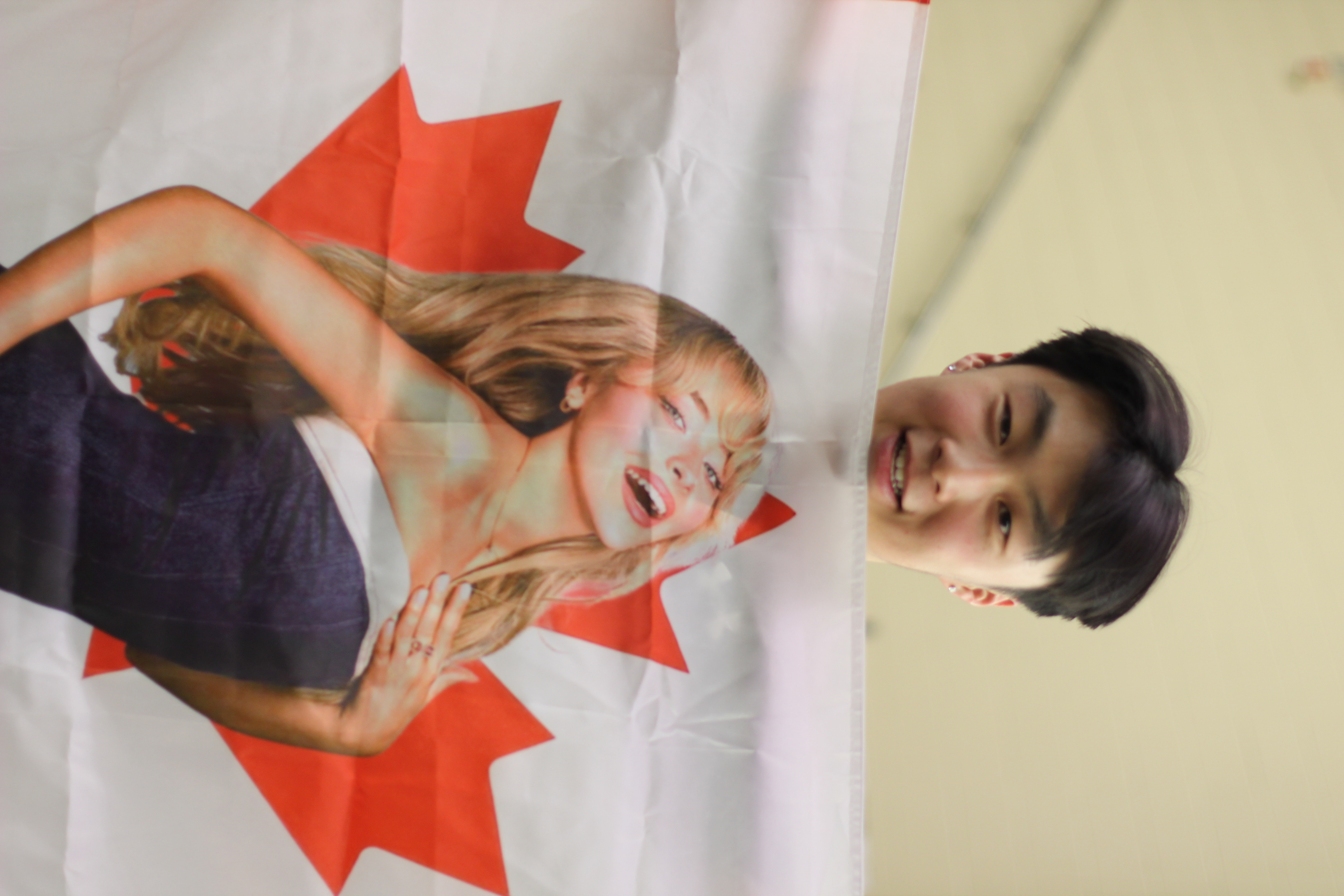
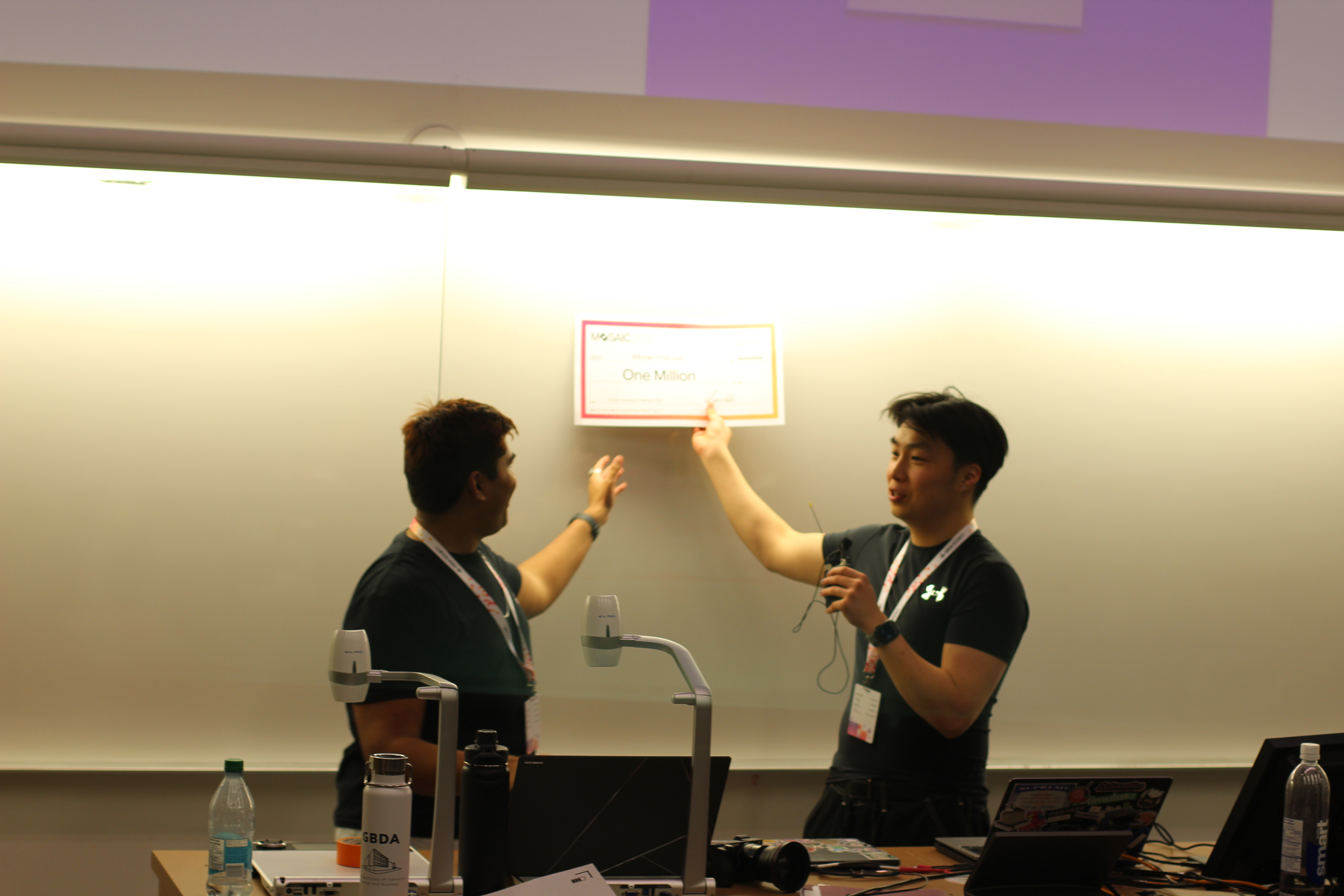
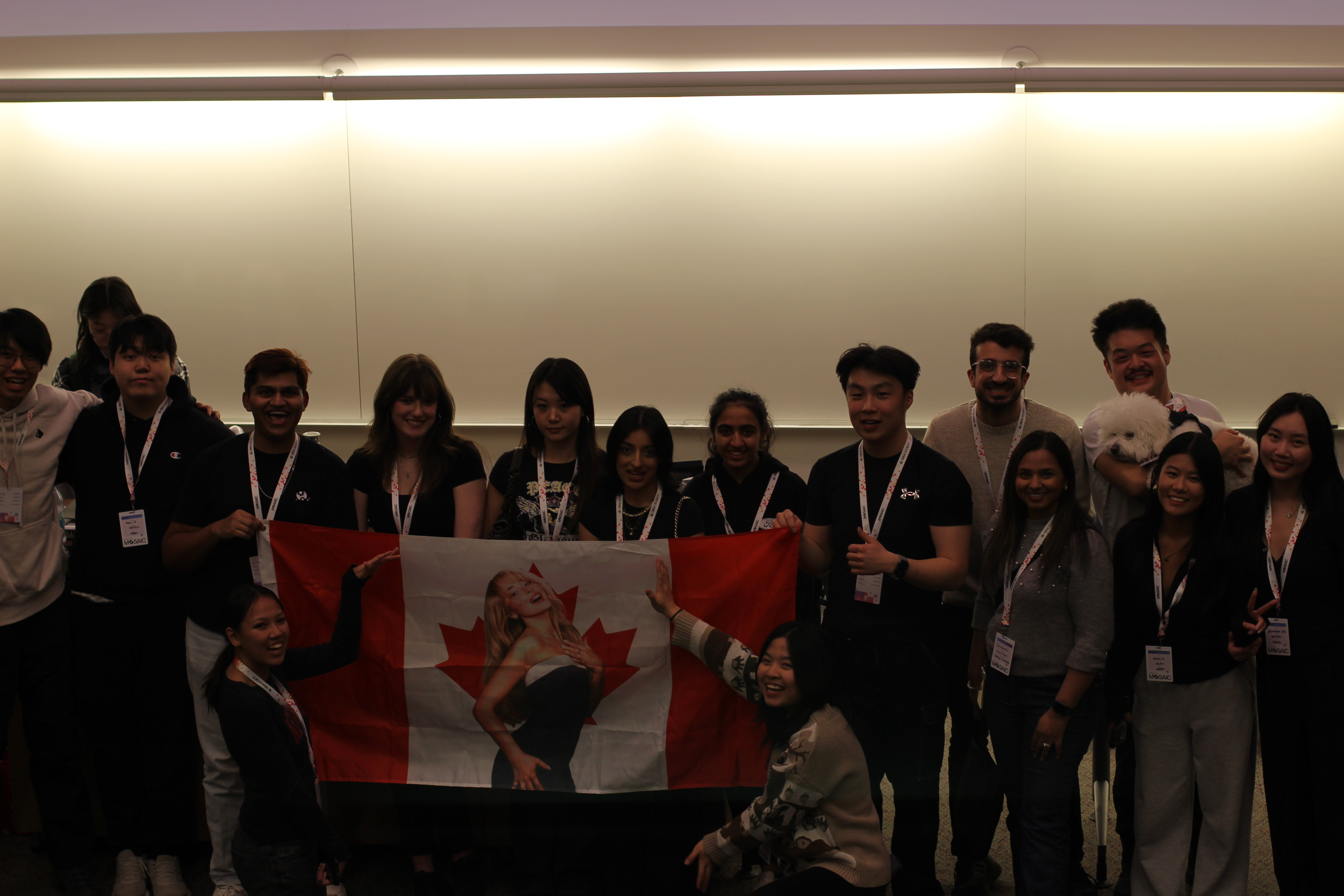
Mosaic Innovation Design Challenge
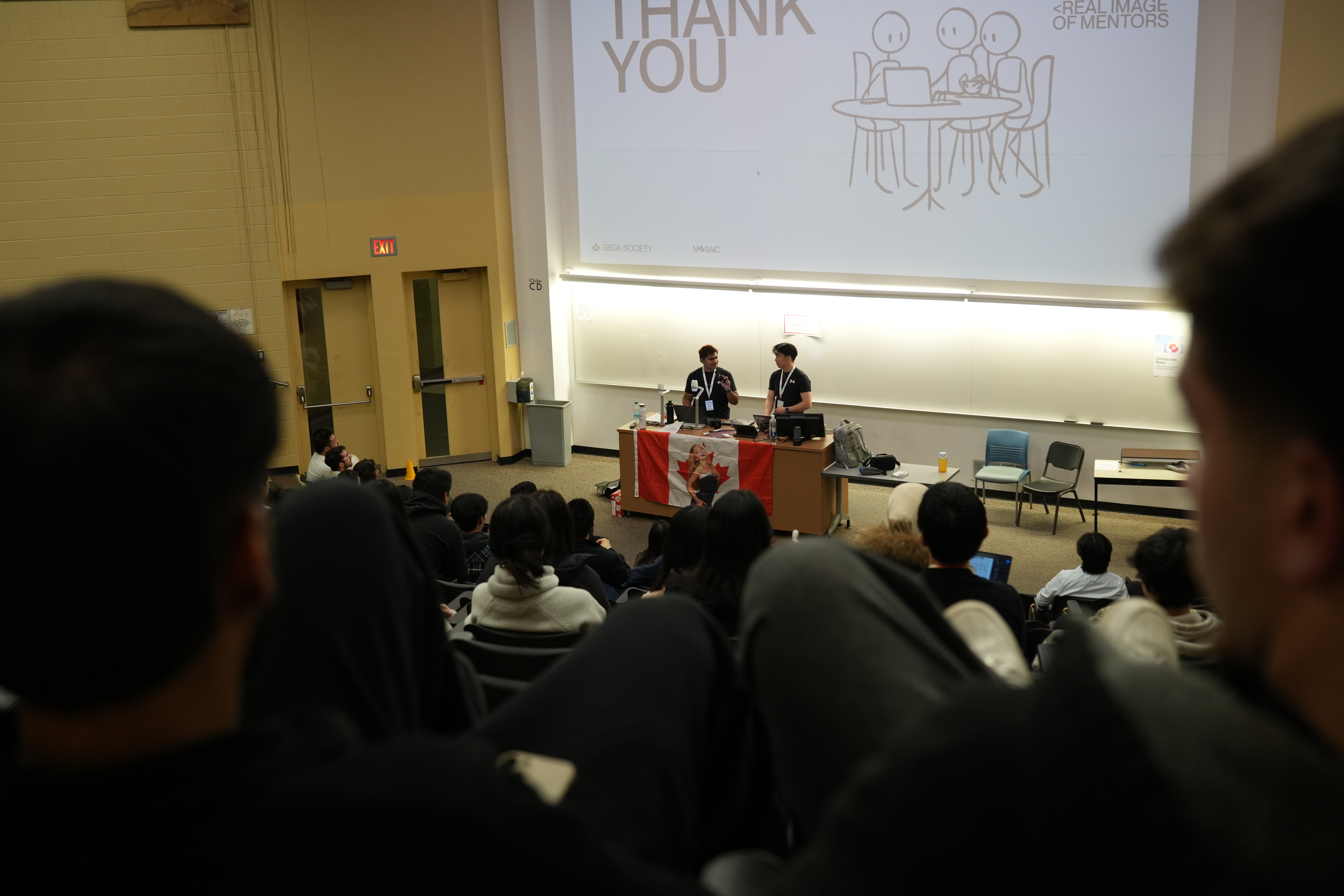
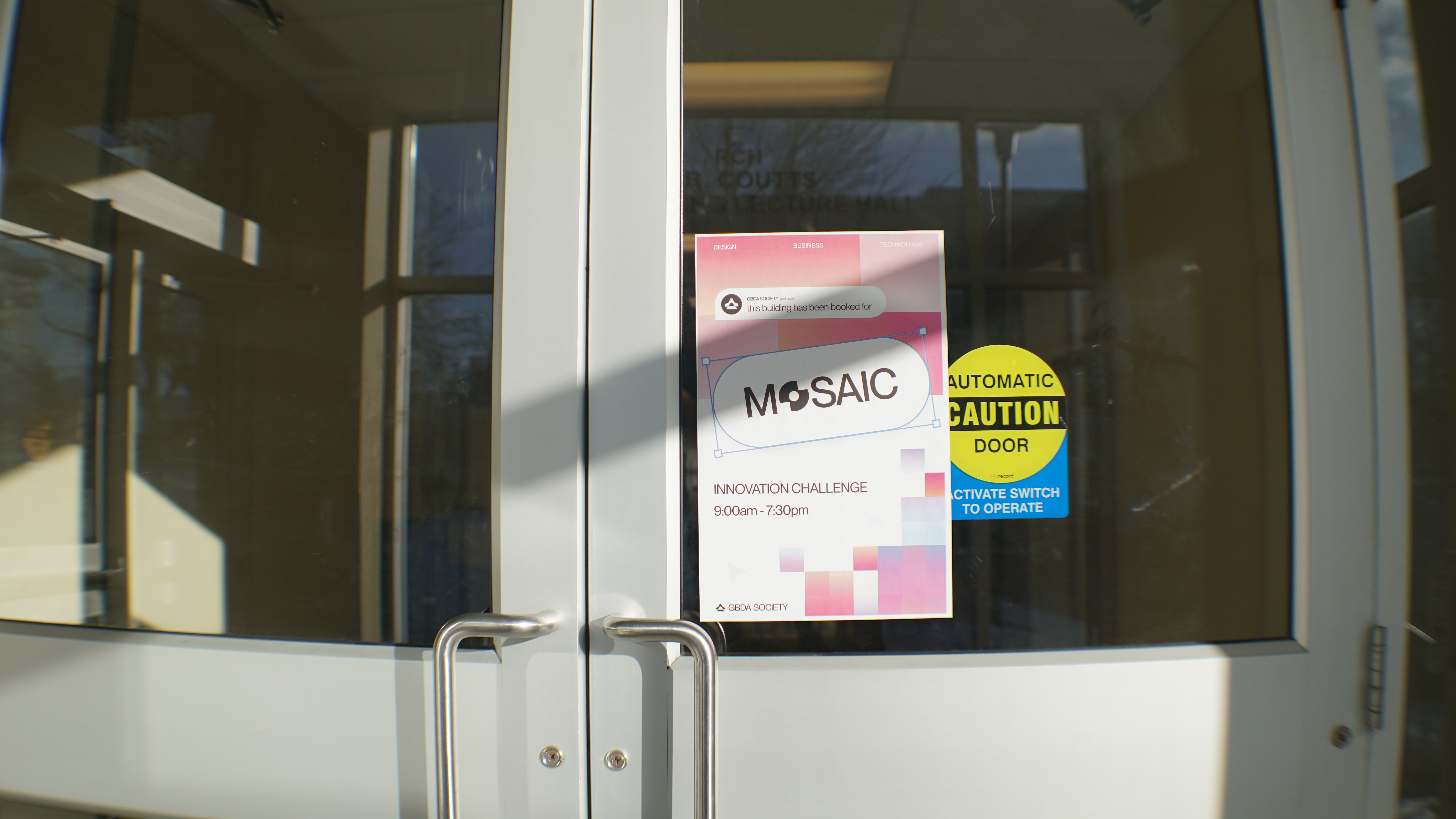
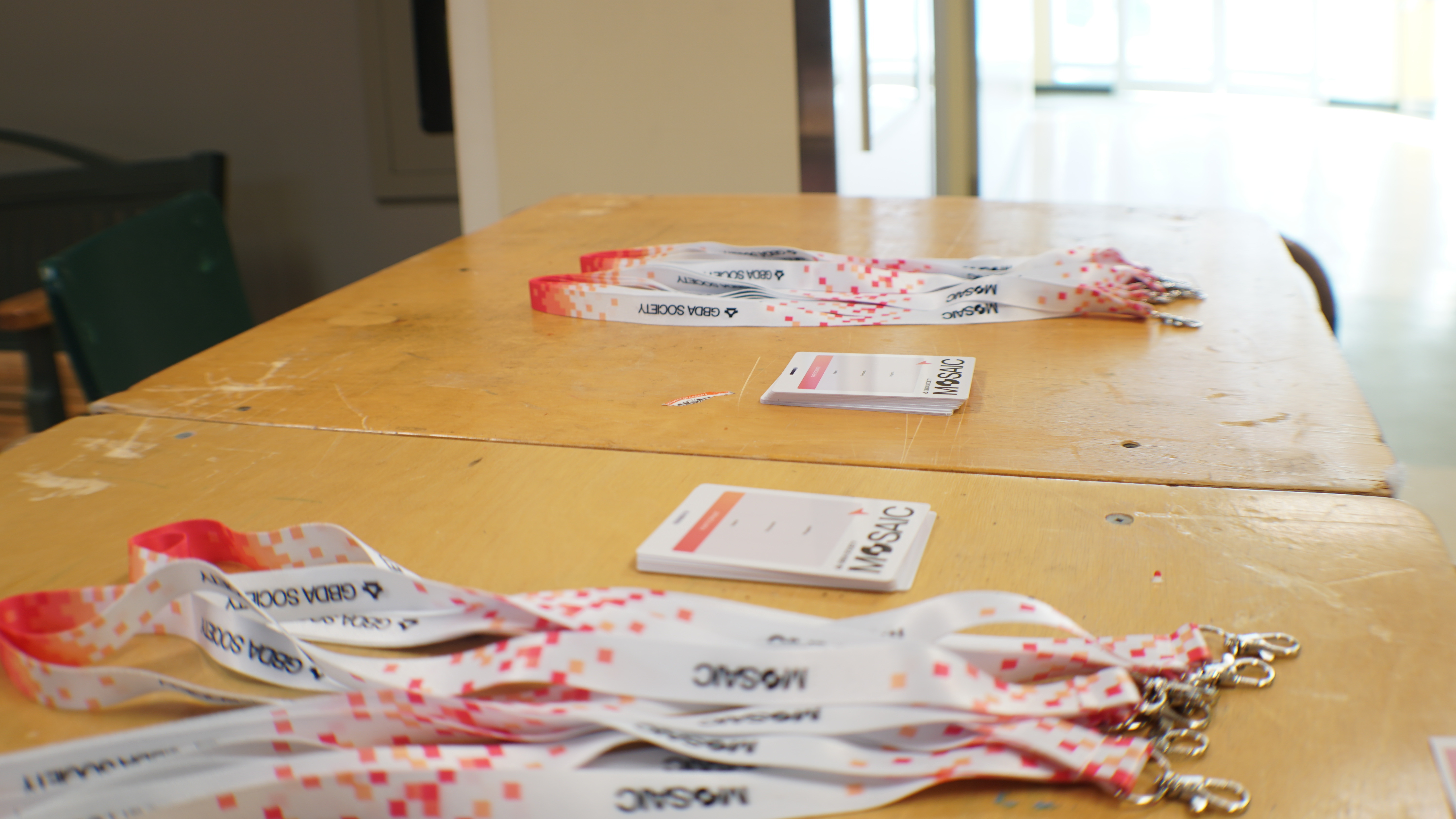
As co-host of the program’s first-ever case competition, I helped lead one of our biggest events to date which included overseeing marketing efforts and guiding the competition on stage.
120+
Participants
4
Universities
5
Industry Professionals
Social Media
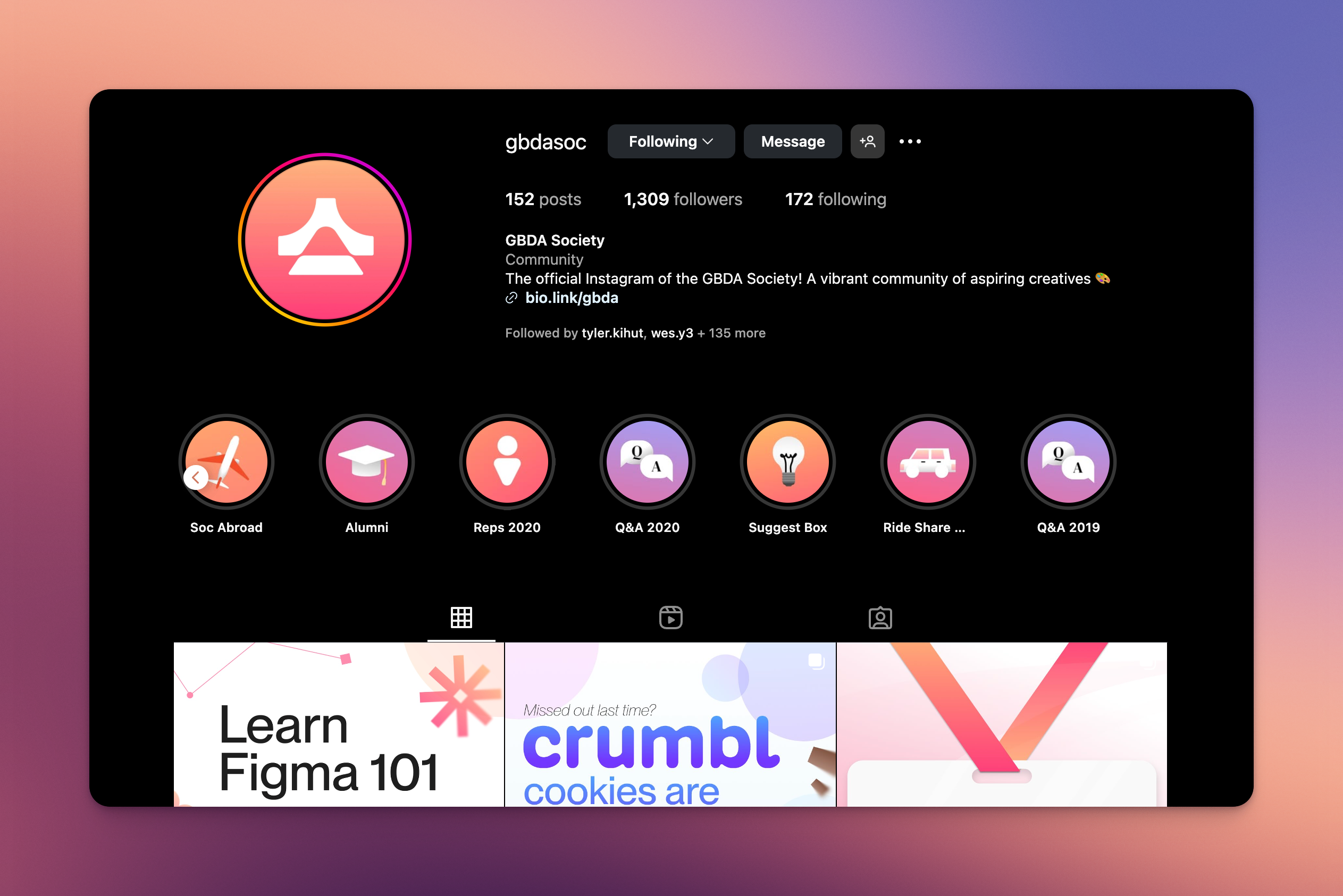
My team and I designed posts, stories, and reels which typically highlighted student work and upcoming events. This event helped build a consistent, approachable brand voice resulting in...
18%
and growing student engagement
200+ monthly
new followers across instagaram and linkedin
Content
Before
After
Who are G+C Architects?
Graziani + Corazza Architects (GC Architects) is a Toronto-based firm known for shaping modern skylines with bold residential, commercial, and mixed-use projects. With a reputation as one of Toronto’s top architecture practices, their work blends contemporary design with functional, people-first spaces across Canada and internationally.
The Problem
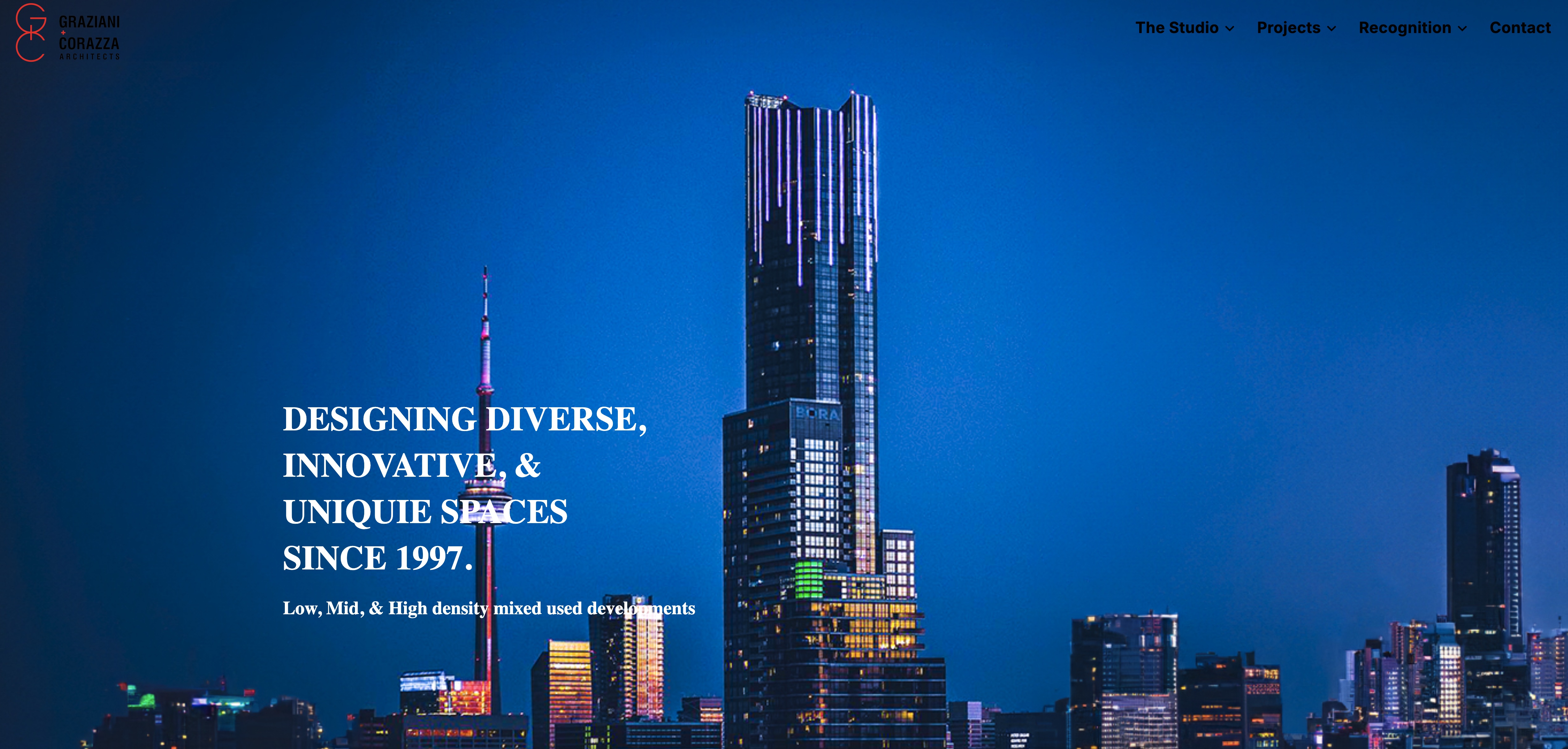
GC Architects’ previous website was outdated and difficult to navigate.
Lower
engagement rates
Outdated
Didn't reflect their product designs
Unresponsive
Missing mobile view
Hard to navigate
Had little visual hierachy
Why
An architecture portfolio is more than just a website it’s often the first impression for clients, developers, and partners.
Impression
A website is a touchpoint for clients
Market Position
ensuring they stand out not just in the skyline, but in digital spaces where decisions are made
Acessibility
A mobile-responsive, well-structured site makes their work accessible to people browsing from anywhere
Solution
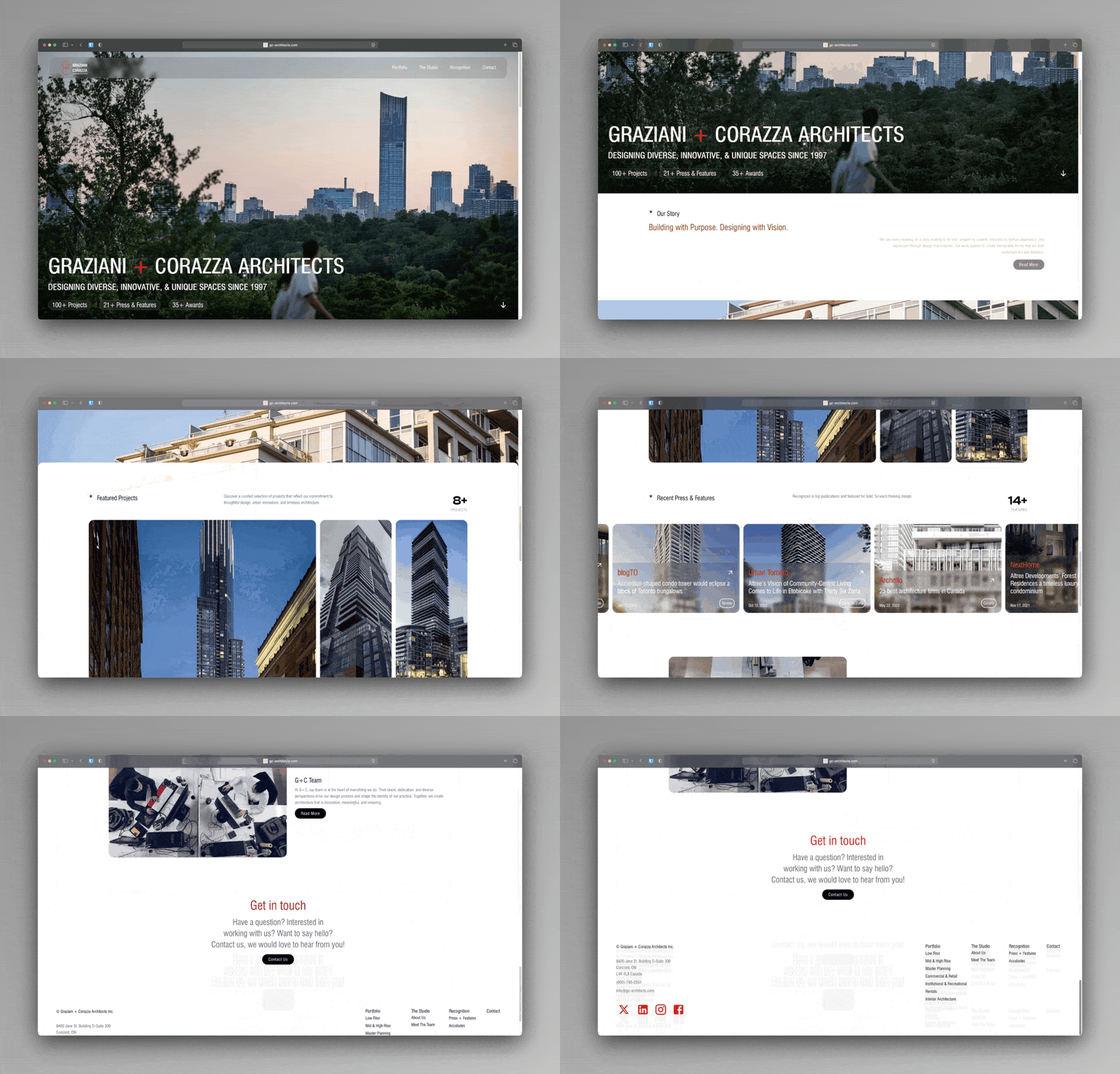
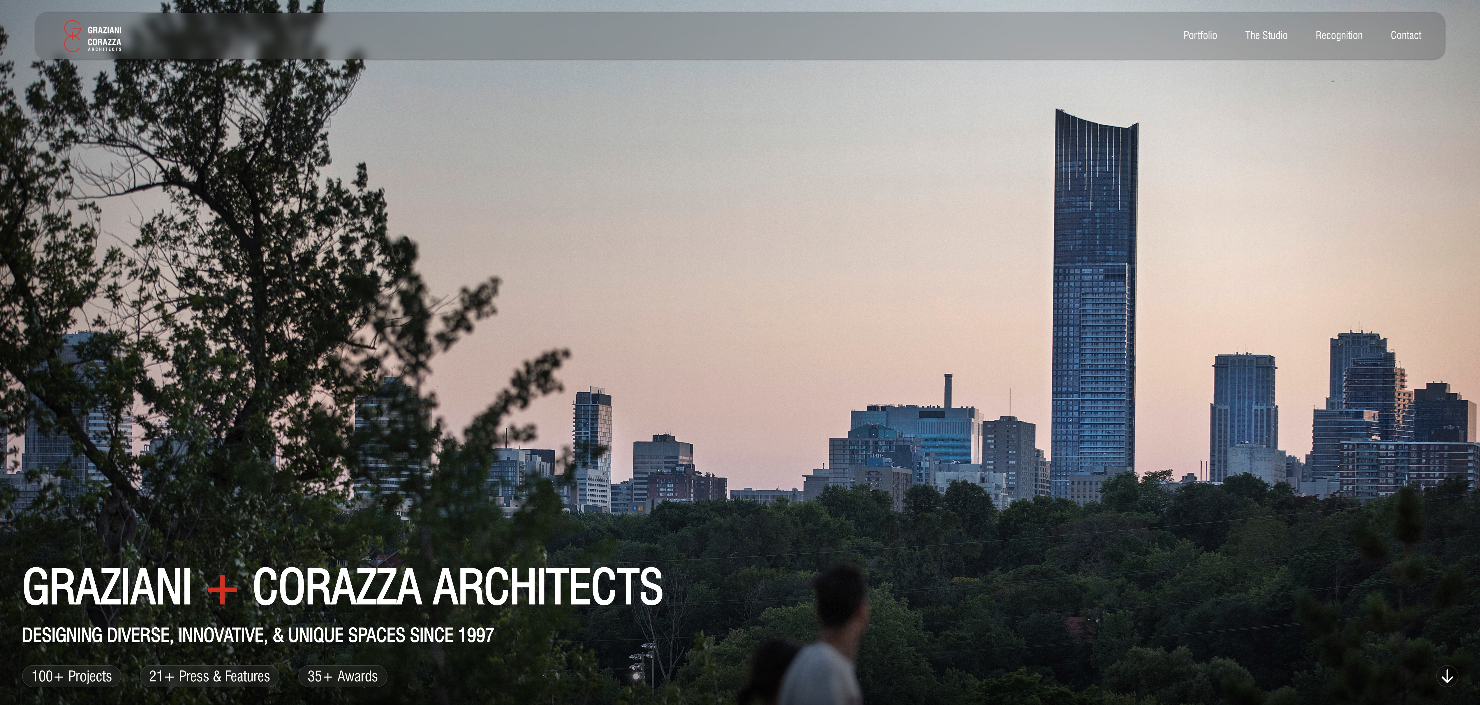
Refreshed
Visual Identity
User Centric
Easy to use clean navigation
Design System
Consistent and unique language
Process
1. User Research and Audit
We conducted stakeholder interviews and a heuristic evaluation to uncover usability gaps and audience needs.
2. Information Architecture
We restructured navigation into a clear hierarchy, streamlining user flows to highlight key projects.
3. Wireframing and Prototyping
We translated insights into low-fidelity wireframes, iterating into high-fidelity prototypes to refine layout and hierarchy.
4. Design System
We built a cohesive design system with grid-based layouts, typography, and interaction patterns for consistency.
5. Testing and Iteration
We validated prototypes with stakeholders and refined interactions to align with both user needs and brand positioning.
Results
Elevated brand positioning
Stronger alignment between digital and real world reputation
Clear and improved acessibility for clients and partners
What is Tinybox Systems?
TinyBox Systems is a Canadian cleantech startup based in Toronto, building modular, net-zero homes that assemble in days, cut emissions and cost by up to 90%, making sustainable housing possible where traditional builds can’t.
Innovation Designer - Product & Growth
is a cross-functional role blending product design, marketing, engineering and sales strategy.
Revolutionizing the housing industry
90%
Fewer parts
10x
Faster assembly
3x
Lower cost
(compared to avg home in toronto)
Sales Driven Design
$500,000+
In 4 months
