林偉明
Graziani + Corazza Architects is a renowned architectural firm, but their digital footprint didn't match their physical skyline. Their website was outdated and disjointed, failing to reflect the modern elegance of their buildings.
Timeline
4 weeks
Tools
Figma, Framer, Claude
Team
Paired with another product designer
Graziani + Corazza Architects portfolio website

Project Scope

This client project shifted me to go from Product Designer to Digital Architect. My goal was to modernize their entire web presence, creating a unified design system that mirrors the firm's structural style and creates a polished, intuitive space for prospective clients.
G+C website before redesignG+C website after redesign
Before
After

The Challenge

Core design principles of G+C Architects
Core Principles of G+C
"We've always been known as one of the top architect firms in Toronto but we've always had clients mention that one of our touchpoints being our website lacked that professional, elegant essence we're known for."

The "Unpolished" Gap

In architecture, perception is everything. G+C's existing site lacked uniformity, making the firm look "less prepared" than competitors with slicker portfolios.
The Disconnect

Their buildings were modern and structured; their website was chaotic and dated.
The Friction

Clients struggled to navigate the portfolio, leading to missed opportunities to showcase relevant expertise and a lack of professionalism.

How might we?

Translate the structural elegance and precision of G+C's physical buildings into a digital interface that instills confidence in high-value clients?
As a developer/client

I want to quickly filter projects by type (e.g., High-Rise vs. Commercial), so I can assess if G+C is the right fit for my specific investment.
As a firm partner

I want a digital portfolio that looks uniform and pristine, so that I can present our work to stakeholders without apologizing for the website.

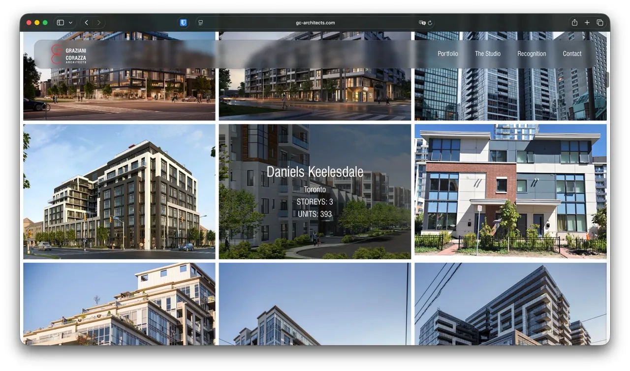
The Solution: A Digital Gallery

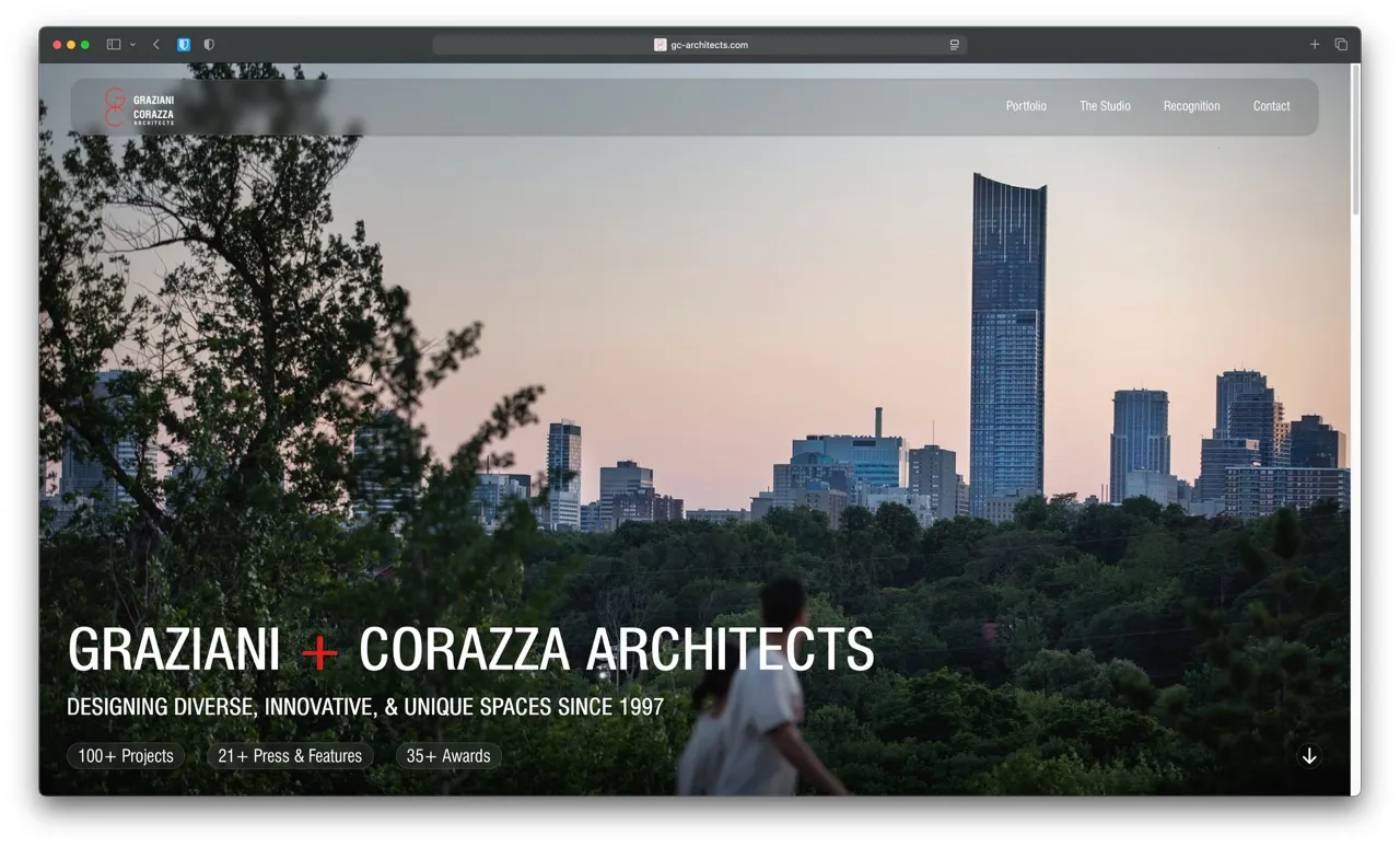
I approached the website redesign with the same principles used in architecture: Structure, Grid, and Light.
Portfolio filtering and navigation system
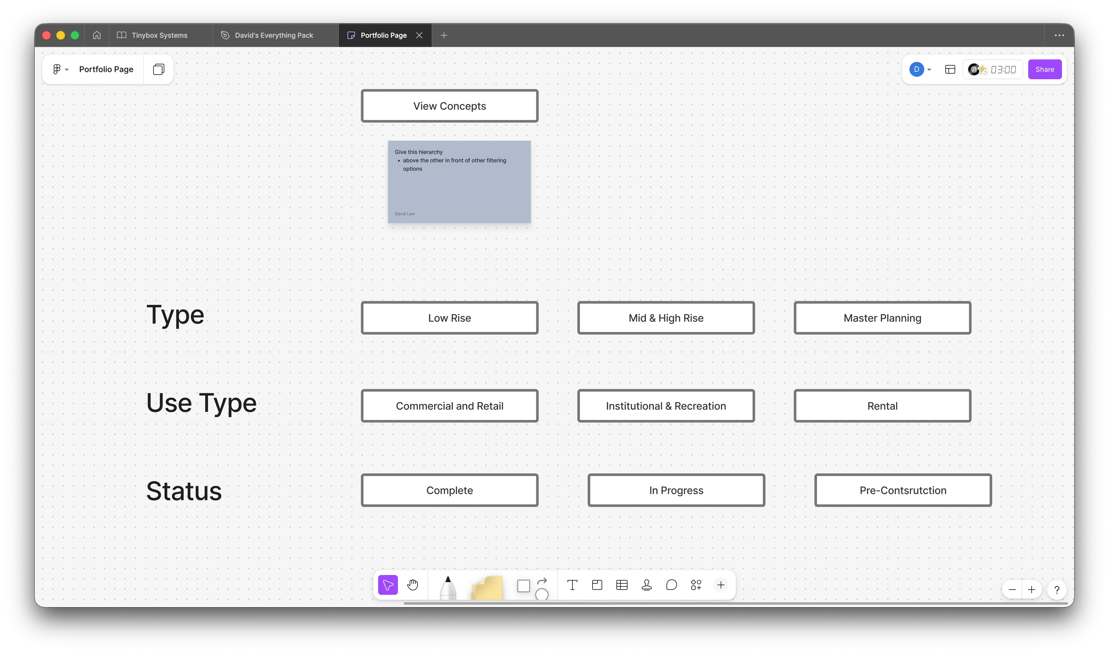
Navigation & Discovery
Streamlining the information architecture. I introduced clear, intuitive filtering systems that allow users to navigate the firm's vast portfolio by sector and typology effortlessly. The content strategy moved from "hunting" to "discovering."
Lead by Design
The site minimized the use of strong heading and typography to let the architectural photography do the heavy lifting. The interface recedes, allowing the buildings to take center stage.
Photography-forward project page design

Impact

The redesigned site delivers a unified, modern brand presence, closes the competitive "polish" gap, and turns the portfolio into a clear business-development tool that improves navigation and strengthens client confidence.
Next Case Study
Tinybox Systems →